Graphic design is a creative process at Whiteduck Design. It is the process which is essential to produce the best solution for your logos, banners, magazines, booklets, web posts and TV slides. It is very important to consider all aspects of development of the design to achieve perfect results for you. This applies whether it is for a product or a personalised booklet or pamphlet. Whiteduck aims for excellence in graphic design and wants the outcome to suit your needs.
Logos
Logo graphics are an important part of the marketing of your business. Logo graphics need to represent the person, business or commodity. The design works best if simple and needs to be able to be viewed in large and small formats. It is important that the design works well in black and white as well as colour. Logos can be incorporated into website headers, business cards and banners.
Business cards and Banners
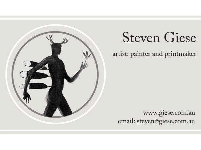
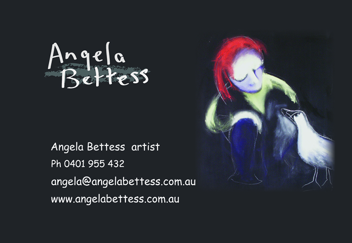
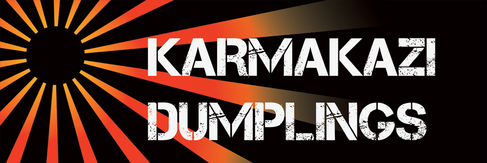
Business cards can incorporate the business logo as an identifier. Either one or both sides of the card can be used and this depends on the design preference. Signatures for emails can detail the business logo, contact details and mission statement in a similar fashion. Banner design needs to allow for required size such as large banners for conferences and meetings. Colour is important to reflect the identity of the business or individual.
TV slides
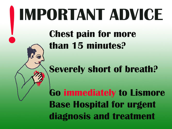
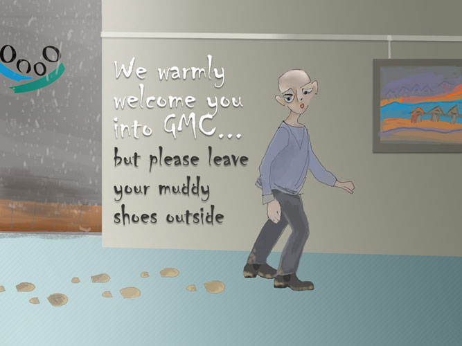
Waiting room slides can promote the services of a business. It is best if slides contain simple messages. In the waiting room environment, there is a captive audience with limited time available. It is important for the wording to be precise.

Retro Styling
Retro art style has been used in advertising since around the 60’s. Derived from artists such as Roy Lichtenstein and Andy Warhol, its pop art style has found a resurgence. Whiteduck is embracing the style and it can be incorporated into any graphic design project – think about logos, TV slides, web posts, greeting cards and on business pages. The line ‘everything old is new again’ is working in graphic design. The tertiary retro colour palette is the basis for a strong design. The imagery is making use of circles and stars for retro effects. Whiteduck Design is enjoying modern technology to create old effects and they still work well in design.


